- Posts: 10452
- Thank you received: 70
stimulus
- Blazer Bob
-
 Topic Author
- Mountain Legend
-

Less
More
09 Sep 2010 16:35 #1
by Blazer Bob
stimulus was created by Blazer Bob
Please Log in or Create an account to join the conversation.
- HEARTLESS
-

- User is blocked
-

Less
More
- Posts: 4316
- Thank you received: 30
- Nmysys
-

- Mountain Legend
-

Less
More
- Posts: 4563
- Thank you received: 0
- Nmysys
-

- Mountain Legend
-

Less
More
- Posts: 4563
- Thank you received: 0
- Travelingirl
-

- Mountain Legend
-

Less
More
- Posts: 820
- Thank you received: 0
09 Sep 2010 17:21 #5
by Travelingirl
Replied by Travelingirl on topic stimulus
get me a cigarette...
Please Log in or Create an account to join the conversation.
- pineinthegrass
-

- Mountain Legend
-

Less
More
- Posts: 2836
- Thank you received: 25
09 Sep 2010 21:59 #6
by pineinthegrass
Interesting graph. It's only a 2.5 yr period, but still interesting. The changes are kind of exagerated in that it shows 10% or less change as pretty huge.
For this 2.5 yr period, one could say more than half the private sector job loss happened under the Bush administration (4% under Bush raising to about 7.3% under Obama), and it's been improving since Jan 2010 (to 6.8% according to that graph).
Or one could say government employment increased 4% during Bush, and about 6% under Obama (after it was already increasing big time).
But a lot depends on how you present the data. Let's consider looking at government employment during a much longer time frame, like over the last 34 years (since 1976 which is when Carter got in office).
http://www.calculatedriskblog.com/2010/09/government-employment-since-1976.html
BTW, the increasing "blips" you see every 10 years are due to the census.
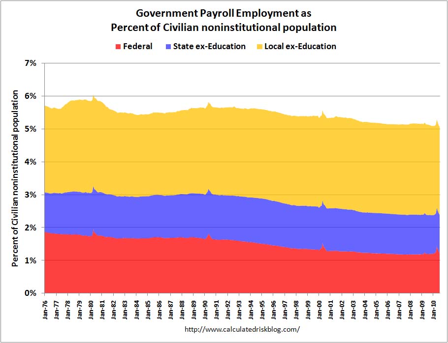
And if we leave out teachers from the government jobs, you get this...
Hey, I don't like seeing federal employment exceed population gain either. I'm just saying it all depends on how you present the data. And with that 2.5 year period you showed, I don't like how federal employment has increased. But I don't think you can blame the Obama administration so far for the loss of private sector jobs. Most of it happened before he got in office (according to your graph).
And if you look at very long term graphs (assuming they are correct... haven't researched it, and not sure your's is correct either, but I'll accept both for this discussion), it looks like federal employment has actually been decreasing long term, when you adjust for population growth.
Replied by pineinthegrass on topic stimulus
neptunechimney wrote: Who got stimulated?
http://stonescryout.org/?p=3735
Interesting graph. It's only a 2.5 yr period, but still interesting. The changes are kind of exagerated in that it shows 10% or less change as pretty huge.
For this 2.5 yr period, one could say more than half the private sector job loss happened under the Bush administration (4% under Bush raising to about 7.3% under Obama), and it's been improving since Jan 2010 (to 6.8% according to that graph).
Or one could say government employment increased 4% during Bush, and about 6% under Obama (after it was already increasing big time).
But a lot depends on how you present the data. Let's consider looking at government employment during a much longer time frame, like over the last 34 years (since 1976 which is when Carter got in office).
http://www.calculatedriskblog.com/2010/09/government-employment-since-1976.html
BTW, the increasing "blips" you see every 10 years are due to the census.
And if we leave out teachers from the government jobs, you get this...
Hey, I don't like seeing federal employment exceed population gain either. I'm just saying it all depends on how you present the data. And with that 2.5 year period you showed, I don't like how federal employment has increased. But I don't think you can blame the Obama administration so far for the loss of private sector jobs. Most of it happened before he got in office (according to your graph).
And if you look at very long term graphs (assuming they are correct... haven't researched it, and not sure your's is correct either, but I'll accept both for this discussion), it looks like federal employment has actually been decreasing long term, when you adjust for population growth.
Please Log in or Create an account to join the conversation.
- FredHayek
-

- Mountain Legend
-

Less
More
- Posts: 31064
- Thank you received: 180
09 Sep 2010 22:58 #7
by FredHayek
Thomas Sowell: There are no solutions, just trade-offs.
If you have kids, make sure their goverment monopoly student loans buy them the education they need to become federal employees because private sector jobs are going away.
Thomas Sowell: There are no solutions, just trade-offs.
Please Log in or Create an account to join the conversation.
Time to create page: 0.143 seconds


